← Back to selected work

07 / Product design case study · 2026

Meal GardenSmall steps.
Everyday nourishment.

A meal-planning experience that makes room for familiar food, busy days and changing preferences.

Designed by
B. Vignesh
Scope
Product flow, UI & prototyping
Platform
Responsive web app
Status
Public demonstration
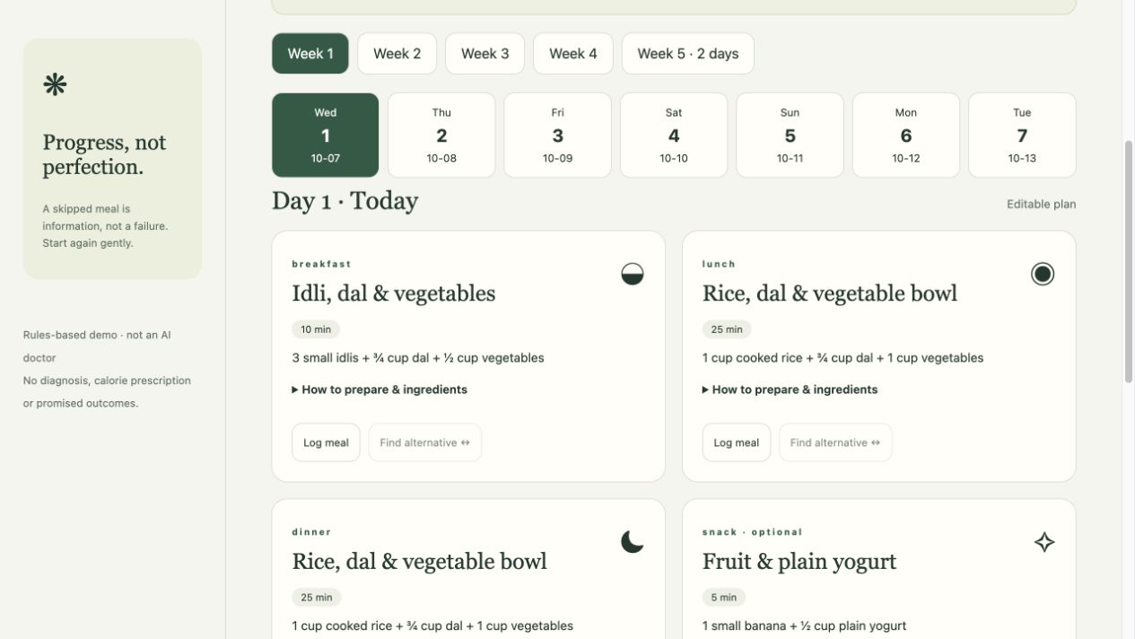
Meal Garden interface with a weekly day selector, familiar meals and logging controls
Actual prototype interface · fictional demo content

01 / The opportunity

A useful plan has to fit
a real day.

The starting design question was simple: how can an everyday meal plan stay useful when someone’s ingredients, cooking time or preferences change?

Meal Garden explores this through a small recipe catalogue with a South Indian emphasis. Familiar staples such as idli, rice and dal anchor the experience. The focus is a manageable next meal and a flexible routine, rather than a perfect score.

Project scope: this is a designed and implemented prototype. The case study documents product decisions and working behaviour; it does not report a user research study, clinical validation or measured health outcomes.

02 / The product journey

Set a rhythm.
Keep room to adapt.

  1. 01

    A four-step starting point

    Profile → food preferences → explicit health and safety questions → practical limits and consent. The steps make a long form easier to navigate and allow people to go back before saving.

  2. 02

    One day inside a weekly view

    Eligible adult demo profiles receive 30 or 42 days of example meals. Week and day selectors lead to breakfast, lunch, dinner and optional snacks, with preparation details close to each meal.

  3. 03

    Record reality or find an alternative

    Log a past or current meal as eaten, skipped or replaced. For a future unlogged meal, enter available ingredients, preview an alternative and choose whether to accept it.

  4. 04

    Check in before changing the plan

    Explicit preferences, cooking time and budget can inform later unlogged meals. Proposed changes remain a preview until accepted; completed records and reviewed weeks stay intact.

03 / Design decisions

Clarity is built into
the small moments.

01 / Reduce the planning horizon

Show the next day, keep the week accessible.

A month-long plan is broken into seven-day sections. The selected week and day have distinct active states, while later weeks are explicitly provisional. This makes the current task visible without hiding the wider plan.

02 / Make flexibility concrete

Preview first. Accept second.

Meal swaps require the available ingredient names, including cooking essentials. The replacement appears before it is saved. If the small catalogue cannot provide a suitable option, the experience explains that limit rather than inventing a meal.

03 / Preserve agency

Record what happened without a failure score.

“Skipped” and “ate something different” are valid logging choices. The interface treats these as information, preserves completed records and avoids interpreting a single entry as a health result.

04 / Keep shopping connected

Let the checklist follow the remaining meals.

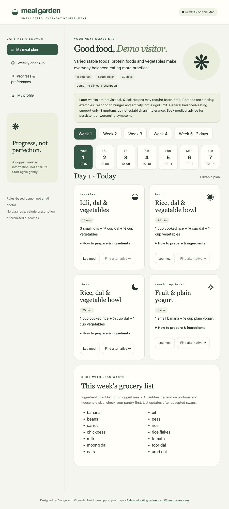
The weekly grocery view collects ingredients from unlogged meals and updates after accepted swaps. It is an ingredient checklist; household quantities are left explicit rather than presented with unsupported precision.

Trust is part of the experience

Knowing when
to pause.

Explicit health restrictions and selected safety answers can stop plan generation and route the person to professional review. Updating a health profile can also hide the previous plan as unsuitable.

The working demo uses rules and a limited recipe catalogue. It does not connect to clinical AI or a nutrition database, prescribe calories or promise health outcomes. That boundary appears in the product itself.

04 / The interface

Calm on a desk.
Useful in the kitchen.

Warm off-white surfaces, muted greens and clear type give meal information room to breathe. On a smaller screen, meal cards form a single column and the navigation moves above the content.

Desktop · meal planOpen full screen ↗
Desktop Meal Garden prototype showing a left navigation rail, week and day selectors, four meal cards and a grocery checklist
Desktop prototype · scroll to explore the complete screen.
Mobile · meal planFull screen ↗
Mobile Meal Garden prototype with navigation above the content and stacked meal cards
Mobile prototype · the same flow in one column.

Screens show the original local prototype with a fictional “Demo visitor” profile. The public companion uses the same meal-planning interface and saves each visitor’s sample data in their own browser.

05 / From screens to a working product

A concept you
can actually explore.

The deliverable is a public, responsive browser demo with onboarding, plan navigation, meal logging, ingredient-based swaps, weekly proposals, grocery checklists and saved plan history.

The implementation began as a local Python and SQLite prototype. The public companion uses HTML, CSS and JavaScript with browser storage. Each visitor can try the core interactions without an account; clearing site data removes their saved demo plan.

The main design lesson: flexible planning depends on making the boundary between a suggestion, an accepted change and a completed record clear. That distinction shapes both the interface and the underlying behaviour.

What comes next

Usability testing with people who plan and cook everyday meals would test the form length, pantry input and check-in flow. A broader catalogue, professional review of nutrition and safety rules, and a deliberate account and privacy model would be needed before extending this beyond a demonstration.
See the decisions in action

Take a look.
Try a small step.

Use fictional details to explore the public demonstration.

Open Meal Garden ↗← Explore more of my work
