An art gallery.
Not just a catalogue.
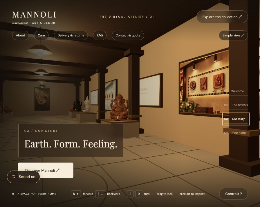
Mannoli Art brings traditional cow-dung-based artwork into a warm, walk-through digital atelier—giving visitors a place to explore before they enquire.
Mannoli Art · Live website
Visual experience, spatial interaction & web implementation
Three.js, GLB models, HTML, CSS & JavaScript
01 / The challenge
A conventional product grid shows objects, but does little to communicate the feeling of entering an art space. The brief was to make Mannoli's website feel like a visit to its gallery, while keeping the collection and practical information easy to find.
The central horse artwork needed to remain the primary focal point. Additional statues and wall pieces had to enrich the environment without overwhelming it.
02 / The journey
Enter → explore → inspect → enquire.
Visitors begin with a clear invitation to enter. Keyboard hints, drag-to-look controls and room shortcuts offer multiple ways through the space. Artwork inspection and collection panels provide context; contact and quote information give exploration a useful next step.
A separate simple view provides an alternative to navigating the 3D environment.
03 / Key design decisions
A clear visual hierarchy
The horse stays central. Sculptures sit on secondary plinths, alternating along the gallery, with wall collections supporting the spatial story.
Variety without visual clutter
Ganesha finish studies, a Buddha fountain and a rock-fountain model bring variation. Supplied models retain their recognizable forms; finish variants are not presented as different sculptural poses.
Atmosphere with visitor control
Warm lighting, subtle lamp effects and an Om soundtrack create atmosphere. Sound has an off control, and playback respects browser restrictions. Motion effects account for reduced-motion preferences.
Details beyond the artwork
About, care, delivery, returns, FAQs and enquiry content support practical decisions alongside the visual experience.
04 / Making 3D practical
Large supplied models were optimized for web delivery. The Ganesha rock-fountain asset was reduced from approximately 58 MB to 6.14 MB through mesh and texture optimization. Repeated Ganesha displays share loaded geometry rather than downloading a separate model for every finish.
The gallery uses actual artwork imagery and lightweight HTML information panels. The 3D experience stays separate from the simpler content view.
05 / Outcome & next steps
A published, navigable gallery now combines the collection, sculptural displays, sound controls and enquiry information in one experience.
This is an implementation case study. No measured conversion uplift, sales increase or formal usability-study results are claimed.
Next validation priorities: observe first-time visitors finding a piece and requesting a quote, test on lower-powered phones, and refine navigation and loading based on those findings.